


In this month’s blog, we’d like to share with you a really useful design principle – in fact probably THE most useful design principle – which you’ll find invaluable when doing things like sourcing photographs for your new brochure, or thinking about how you might like your new leaflet or business card to look.
Of course, Instaprint printers in Nottingham are the experts in this sort of thing, and we certainly don’t expect our customers to do our work for us! But we find it’s always really helpful if people understand the same concepts which our professional designers are working with.
And the principle we’re talking about is called “The Rule of Thirds.”
So, what is it?
The Rule of Thirds is a principle which is widely used in the composition of photographs and graphic designs. In simple terms, it involves dividing up the image, or page, into nine equal segments by using two equally spaced vertical lines, and two equally spaced horizontal lines – rather like a noughts and crosses grid.
In fact, if you’ve ever played around with some of the settings on a digital camera, you’ve probably noticed that this ‘noughts and crosses’ grid is one of the options which can be selected on the screen or in the viewfinder.
Now, the theory states that if important elements of the image or design are aligned with one or more of the these vertical or horizontal lines, or with the points where any of these lines cross each other, then this creates a more visually interesting, appealing and dynamic appearance.
Let’s try and show you what we mean.
Here are two versions of the same photograph. Why is it that the one on the right just somehow looks ‘better’, more interesting, more professional, more artistic?

The clear and simple reason is that the right hand image has been cropped to make it fit the Rule of Thirds, which can be seen when we apply the grid over the image, as below:

Notice how, in the left hand image, the main subject is right in the middle of the photo. Whereas in the right hand image, the rock pillar is now aligned with a vertical grid line, the horizon is aligned with a horizontal grid line, and also the centre of the rock pillar sits at the intersection of the two grid lines. Perfect composition with just a quick crop!
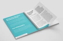
The Rule of Thirds principle applies just as much to the design and layout of a brochure or a business card as it does to a photograph. Take a look at our gallery of projects and you’ll see that many of them use the Rule of Thirds.
It’s a subtle technique which doesn’t by any means have to be adhered to too rigidly, and there are of course many situations where it isn’t appropriate – so don’t be obsessive about the Rule of Thirds, but always bear it in mind. That’s how our professional designers here at Instaprint in Nottingham use the principle to create stunning work for our customers.
For professional help with any design work, please contact us today to see how we can bring your print and design requirements to life.
Images – Wikipedia Commons