


Some people may consider printing and text simply as that – some words telling a story or conveying a message. When it comes to marketing and promotional materials though, there are far more considerations than just picking a font you think looks good – it should complement and enhance your design and its’ purpose! Whichever typeface you choose, it should combine both legibility and readability, whilst remaining appropriate both for the audience and the message it is trying to convey.
There are some things you should bear in mind when choosing your font.
Decide what message it is you are trying to convey
Typically, for a more formal, or “serious” business – accountancy, law and such – then a font featuring straight lettering and closed spacing is more effective. For “softer” businesses or uses, such as a birthday card or leisure-based subject, then a wide-spaced, rounder font will be more appropriate. Crucially, you want your document to look unique and specific – you don’t want it to appear mass-produced and ‘run-of-the-mill’ – choosing the correct font can help you convey your message in the manner you want and that will appeal to your target audience.
Legibility
The best fonts for legibility are those that have conventional letterforms, have generous spacing and ‘tall height’ formats.
Readability
hoose typefaces that are ‘designed for purpose’ – for example, a font that is effective for a headline or poster, will not necessarily be effective for the main body of the document where larger quantities of text will be read. Use hyphens and other punctuation tools to break up the text – long, unbroken ‘rivers’ of text are difficult to read.
Here are some examples of fonts most commonly use:
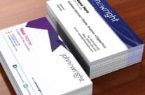
Serif – This font is used regularly for formal documents, such as legal papers, finance documents and such.
Sans Serif – This font is more often used for more personal documents and products.
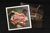
Hand Lettering – This is a ‘personal’ typography – it looks exactly as it’s named – it appears as having been ‘hand written’ and therefore has that ‘individual’ and friendly appearance, personalising the design or document on which it is used.
Script – This is a font most utilised when trying to convey an ‘upmarket’ or superior message. It is a light and elegant style often used by professional companies appealing to the ‘higher-end’ of a market place. It is not usually used in the main body of a text, but more as a header or short, emphatic statement.
Finally, keeping it simple is often a good guideline. Try to keep a limited palette of typefaces – whilst it may be tempting to mix and match a number of different fonts, it can become difficult to read and take attention away from the actual message you are trying to convey.